Former Capcom designer wishes he could’ve stopped awful US Mega Man cover
Designing the cover art for a video game is a delicate operation. If done correctly, you can produce something memorable, eye-catching and enticing which ensures that people will not only buy your much-toiled-over title, but recall it long into the future. Nostalgia = profit, man.
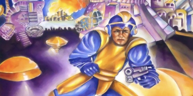
Just think of some of the classic game covers we all know and love – the simplicity of the original Super Mario. Bros (and Duck Hunt), the finger-wagging ‘tude of the OG Sonic the Hedgehog, to more modern examples like the sweeping majesty of Breath of the Wild. However. If done INcorrectly, you can end up with something laughably, unspeakably terrible. Such is the case with the North American box art for the original NES release of Mega Man. It’s… well, just look at it.
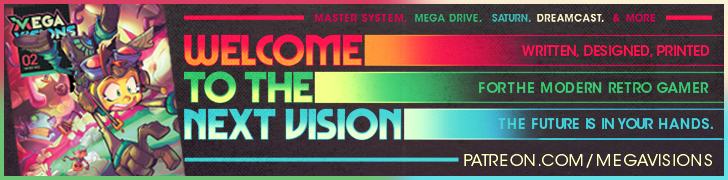
I don’t even know where to begin with this one. It’s difficult to believe anyone even remotely involved with the production of this art ever picked up the actual game for more than twenty seconds. If at all. First off, he’s the wrong colour – but that seems like a paltry criticism compared to the more glaring issues here.
He looks less like a plucky tweenaged cyborg boy than he does a balding middle-aged man forced to cosplay as an astronaut for his son’s birthday party. He’s got a face that suggests he’s just inhaled a whiff of somebody’s flatulence, while sucking on a particularly sour lemon. Rather than having an in-built arm cannon, a key part of the design, he’s got a regular gun in his hand, which is just comical.
I know it’s kind of tough to make out on blurry CRTs with 8-bit graphics, but come on, lads. McDonald’s could do a better promotional poster.

It’s for all these reasons and more that this cover has become the stuff of legend, being rightly criticised by such gaming personalities as James Rolfe – but don’t take my word for it. As NintendoLife reports, former Capcom designer Yoshiki Okamoto has some pretty strong feelings about the atrocious artwork.
“Okamoto – who worked on such legendary titles as Final Fight and Street Fighter II – explains that, had it been his decision, he would have killed the western cover before it entered production,” states the report. Talk about biting the hand that feeds (fed?).
He describes the cover thusly: “so, the overseas version of Mega Man [is] an old man in blue tights wearing a helmet. He’s standing in a bendy, crab pose with a tube in his hand. And I couldn’t believe this was allowed to happen. It’s like, I’m sure everyone hates it! I mean, we made this game together, you know. But because it had to cross the ocean, we had to listen to the opinions of the marketing staff over there about what’s “appealing” and “popular”.”
Frankly, whatever test group they quizzed who cited that monstrosity as ‘appealing’ or ‘popular’ need, to quote Garfield of all people, to be drug out into the street and shot.

Still, the cover must have its fans, as Mega Man was a smash, and the series continues to this day – thankfully, with rectified box art for all subsequent entries. Bless you, Capcom.
Are you as appalled by the cover art as we are? Any other hilarious covers you know of? Let us know!
Via, Nintendo Life.